

How To Make Fabric Look Worn
Illustrating worn clothing: 4 top tips
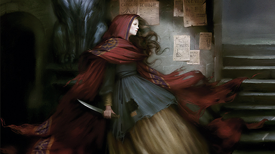
There are several options to consider if you want to learn how to draw worn clothing. In this example, my drawing tips will show you how to make a cloak look old and torn. For the colours, the tones must be desaturated. Furthermore, the cloak isn't new so the fabric needs to look worn and weathered.
To give the fabric a sense of age, I add some torn areas all over the cloak, especially on the bottom and the edges where it's in contact with the ground. I also add some threads to accentuate the wear effect, and some patches to give the impression that the cloak has been mended several times by its owner.
I want to convey the impression that the cloak is made of rich fabrics, so I add some golden patterns around the hood. I don't overwork them or cover the whole cloak in them, though. I need it to suit my character's design, so I suggest that the cloak belonged to a noble family.
Indeed, the storytelling element of the cloak is important. It's a part of my character's history and so the clothes will help me to bring the story into the illustration. I imagine that she's a destitute orphan, whose only connection to her family is the old cloak that she's always seen wearing.
01. Line art and colours
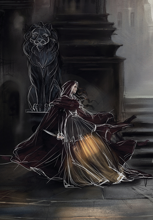
I start with a quick piece of line art, then choose a colour scheme. The character's costume will be quite dark with the bottom of the cloak floating in the air. My colours are desaturated, but I'll add brighter light and patterns later. It's important to find the general shape of the cloak. I want to show off the torn edges to enhance the aged look of the fabric.
02. Basic details
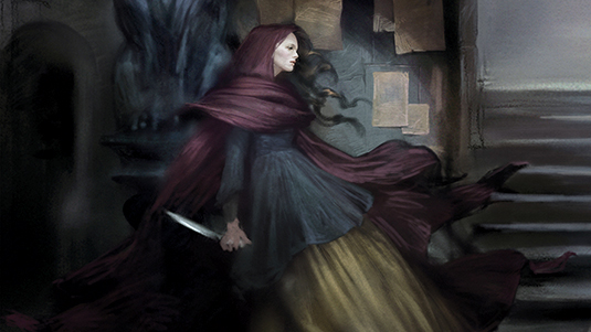
I quickly paint the key fabric folds, following my line art and adding tears to the fabrics. I also want the cloak to look almost like silk so that it floats around my character. To achieve this effect I add more colour variations and tiny folds everywhere. I use a custom brush to paint and sketch because I need to have a lot of texture to make this element look convincing.
03. Colours and texture
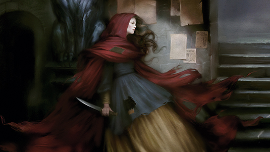
At this point the character needs to be brought to life. The cloak is too much desaturated so I boost the colour scheme with a more vibrant red. Then I refine the torn parts, using a textured brush to introduce more colour variations and realism to the fabric. I also add some holes here and there: this is a nice visual detail to accentuate the old, worn look of the cloak.
04. Patterns and threads
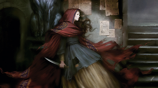
To give the fabric a decadent look, I add some golden and purple patterns. I use a textured brush with very soft edges because I don't want the result to be too neat; the patterns are old and worn. To reinforce this idea, I add some golden loose threads with a very fine brush. The embroidery pattern gives a story to the garment and hints at my character's tragic story.
This article was originally published in ImagineFX magazine, issue 133. Buy it here.
Mélanie is a freelance illustrator who specialises in fantasy. She is a digital painting instructor at CGMA.
Related articles
How To Make Fabric Look Worn
Source: https://www.creativebloq.com/illustration/illustrating-worn-clothing-4-top-tips-51620461
Posted by: clarknoreed.blogspot.com
0 Response to "How To Make Fabric Look Worn"
Post a Comment